Day 3: Moraine Lake

Sunday, September 24, we decided to take the shuttle to Moraine Lake, in spite of having to wait in line for about 1 hour. It was a partly cloudy day, again cold in the morning, but pleasantly warm later on in the day.

The Moraine Lake area is a very popular destination for tourists in Banff/Lake Louise. There are a number of trails that start there. The most popular in Fall is the Larch Valley/Sentinel Pass trail, about 12 km return, total elevation gain 732 m. We decided to ignore the crowd and hike it anyway. The trail starts at Moraine Lake with a series of forested switchbacks for about 2 kms. At the top there is a large area full with larches, all of them in peak colour when we were there.

It isn’t easy to make pictures of larches, at least for me. They are a funny tree. They are scraggly, almost ungainly looking, but just glow with colour. I couldn’t figure out how to do the feel of the place justice. So many trees! So much colour! What to do with it. I suspect it will take a few years of experimentation to figure out how to make beautiful images of larches.

The trail continues with sparser and smaller larches, to a rocky place, where you can see Sentinel Pass ahead. There are also a number of small lakes called Minestimma Lakes.

The mountains around are gorgeous! Harsh looking, yes, rocky, brown/gold, pewter, a bit of snow:

67A1A71F-7113-41C2-9B0B-10AE3209F013282A7AD7-5455-477D-BBC2-879D63C334234CEEC54E-9DDC-4395-A1B5-DF12C615158E

We had lunch at the topmost and largest of the pools. We decided not to go up Sentinel Pass, but lounge around the lake for a while on the warm rocks. This is Sentinel Pass:


Laura decided to take a nap; I walked around to the far side of the small lake. From there, looking back over where we had hiked up, I could see the Valley of the Ten Peaks, which we could also see from the Valley of the Larches before.  The peaks reflecting in Lake Minestimma made for a surreal scene:

1C6BA2EE-41CD-4E03-A562-A79D077CCD06688A0372-CA6F-46FB-91D1-1AF6600754D2C43EF9BC-D5F4-4CB7-9B7D-9AC812655B47

After a while we returned to Lake Moraine, same route as going up.  The larches and the peaks were, if anything, even more beautiful than before:

That evening we went out for pizza at Lake Louise Village.  It was a great day overall!

Day 2: Lake Louise

On Saturday, September 23, 2017, Laura and I hiked in the Lake Louise area. Lake Louise is a small hamlet with a big ski resort, a big campground, and many hotels and motels including the famous Lake Louise Chateau, seen here in the distance from the Plain of Six Glaciers trail:

10

We hiked all day. It was cloudy with sunny breaks, quite cool in the morning, but beautiful for hiking! There are a number of trails that start at Lake Louise. We first took the trail to Lake Agnes and the teahouse there. Lake Agnes is medium in size, quite green, with steep mountains on three sides. There are larches close to the lake and going up the mountainsides. We had hot chocolate at the teahouse.

01

Then we went around the lake, on the side with the larches in the picture above, and up the Big Beehive trail. This is a closeup of sun-sparkles on Lake Agnes:

02

There were numerous larches by the trail. There also was a bit of snow/ice left, that made some of the switchbacks slippery.

From there we hiked down the other side of Beehive, towards the Plain of Six Glaciers trail.  This trail goes up to another teahouse, from where you can hike another couple kms to view Victoria Glacier close up. It is a rather arid landscape, harsh, dry looking to my BC eyes, but spectacular:

07

We hiked as far up as we could, and were at a place where we could see Upper Victoria Glacier above us and Lower Victoria Glacier below us. At the top of a cleft where Upper Victoria winds down towards the lower part of the glacier is an alpine cabin, which looks sort of out of place among all that ice and those tall, pointy, rocky mountains:

08

Glaciers closeup are quite dirty.  They have dust and rocks and other debris on the surface, and don’t look white and pure like they do from a distance:

09

Still, the shapes and colours are beautiful!

We had to hurry back to Lake Louise to catch the last bus back down the mountain. We almost ran downhill, and made it! We ended up hiking more than 20 kms total, up and down, over rocks, ice, snow, and were quite worn out at the end of the day, but it was worth it.

The Canadian Rockies in Fall

This past week one of my daughters and I spent a week camping and photographing the Fall colours in Banff and Yoho National Parks. We had cold nights, but absolutely beautiful days! The mountains had a bit of new snow. The larches in both parks were at their prime, the aspen almost at prime.

The first day we drove through Revelstoke and Glacier Parks, to Lake Louise. The second  and third days we hiked and photographed in the Lake Louise and Moraine Lake areas. The fourth day we made our way to the Lake O’Hara area of Yoho, were we stayed for a total of three days. The last day we spent in Banff proper. Then it was back home, where the trees are just now coming into their full Fall glory.

I don’t often do black and white, but the picture above is a view of the mountains in Glacier Park, on our way East. I thought black and white was appropriate for the scene. Enjoy!


Published in Practical Photography, January 2015 Issue

A couple of my photos will be in the January Issue of Practical Photography, which will be on sale this Thursday, November the 27th.  Here is the cover of the magazine:

cover

The four pictures I sent in are:

Moonlight-on-Pink-Sea Mirage-2 Freedom copy Dream-Wanderer

I don’t know which one they picked.  Surprise!

TUTORIAL #2 – Bokeh Photography, how “Seedling” was made

 photo 1

This is “Seedling”, as published at 500px.  At my own website I called it “Chandelier” .

For this tutorial, “bokeh” refers to the  light circles in the image.  These circles are out-of-focus points of light.  They vary in size, with the smaller circles being closer to the focal plane, the larger ones further away.  The focal plane in the image is very shallow, there is just a sliver of sharpness throughout the photo – the rest is blur.  It is this combination of the sliver of sharpness with all the soft, colourful circular blurs that “makes” the photo.

I shot this image on a Nikon D7000, with my macro lens, the Sigma 150mm f/2.8, no filters/flash.  The image was shot indoors, camera on tripod, seedling sprayed with water in a vase, at ISO 100, f/5.6, 1/800 sec.  The light was sunshine through a window, backlighting the seedling.

The image was intentionally underexposed by 2 full f/stops as part of a series of 3 bracketed images to possibly combine in HDR software.  However, I decided to use the dark (underexposed) image by itself.  This is the image as shot:

photo-2

I opened the image in PSCC without any Camera RAW adjustments. I liked the right hand side of the image, and I liked the many colours I could see throughout the lighter parts of the image in spite of it being so dark.  I decided to crop to a square, and rotate a bit to get the angle I wanted.

photo-3

Then I processed in Photoshop CC:

–  I created copy layer to work on (Layer 2), and applied auto curves to this copy layer: Image -> Adjustments -> Curves -> Options -> Enhance Brightness and Contrast

photo-4

–  Created a copy of the adjusted Layer 2 (Layer 3), and selected shadows in this new layer: Select -> Color Range … -> Select Shadows, Fuzziness 100%, Range 0 -> Hit “OK”

photo-5

–  Cleared the selection (effectively leaving all but shadows in Layer 3): Edit -> Clear and then Command + D.

photo-6

–  Over-saturated Layer 3: Image -> Adjustments -> Hue/Saturation -> Leave all as is except move middle slider (Saturation) to +100

photo-7

  Set blending mode on Layer 3 to “Color”, and blur the layer via Gaussian Blur (at Radius 40)

photo-8

–  For the next part, you can use whatever method you prefer to adjust colours until they look right.  I used 2 copies of the colour layer, applied a violet filter to increase the pinks and tone down the greens in one, and brought back the greens with the second one by masking the green channel only.  There are so many different ways to work with adjusting colour, it really doesn’t matter which one you use, as long as the final image is what you had in mind!

photo-9

–  Created a new layer (Layer 4) with all adjustments so far: Select -> All; Edit -> Copy Merged; Edit -> Paste.  After that, I made final Curves adjustments to this layer to get the contrast and brightness to be as I wanted it.

photo-10

–  The resulting image is not identical to “Seedling”.  This is a new edit, but this is the process I used to create “Seedling”.  Remember, there are many ways to achieve similar results when processing images.  Each photographer has their preferred ways to work, and it is, at least for me, often difficult to explain exactly how I made something or another.  The beauty of it all is in experimentation, trying many different ways to shoot the images you want to shoot, and then trying many different ways to process your images so that you get that image that expresses what you wanted to say with it in the first place.

I hope this helps.

Thank you,

Ursula

www.ursulasphotos.com

www.ursulasphotos.ca

“Chandelier” at Art.com, at AllPosters.com, and at GreatBigCanvas.com.

Two Workshops in New York City – June 23 and June 24

Steve Hill and I will be offering two separate workshops on Saturday, June 23 and Sunday, June 24, in New York City. Each workshop will start with a Meet-and-Greet (including drinks) at the famous Gaslight Tavern, followed by introductory remarks by Steve and Ursula, and a hands-on shooting instruction photo-walk with discussion/Q&As throughout. Both workshops will end at the Landmark Tavern in Hell’s Kitchen, where we will bring the days shoot to closure, producing some finished, edited images while enjoying the tavern’s excellent food and drinks.

Saturday’s workshop will be towards the evening hours, during the golden time when light is precious both for street photography and nature abstracts found in a big city. We will walk/make beautiful photos in New York’s Meatpacking District and in the Highline Park. Sunday’s workshop will take place earlier in the afternoon in Central Park.

Registration will be limited. Food/drinks/everything else included in the package. Details and sign-up are linked below:


Saturday, June 23

Sunday (June 24)

I think these workshops will be a fun learning experience and a wonderful social get together for all participants. Thank you for reading and considering this.

Camerapixo

Camerapixo Magazine is an international publication dedicated to creative photography. It is published once a month, in English and Polish. Camerapixo is available in several formats: online e-Books, PDF, and the Tablet version. It reaches tens of thousands of readers from over 50 countries.

It was a great honor to have been one of the featured photographers in Issue 17 of this magazine.

Artur and Anetta Heller run the magazine. They were wonderful to work with, very professional.

If you haven’t seen this magazine, please give it a good look. It is an excellent collection of photography from around the world, published in a beautiful format. Much to my liking, it has many pictures and not too many words. The tablet format in particular is gorgeous to view. I very much like it that the magazine is keeping up with times, exploring all these new ways of information dissemination, and putting them to very good use. Again, if you haven’t taken a look yet, take a look now.

Camerapixo Issue 17 – Ursula I Abresch

Tutorial #1, “coastlines”

I am hoping to put together a few tutorials. My goal is to write one tutorial per month.

To start out in November 2011, I am reprinting a tutorial I wrote for 1X.com a few months ago. It is the first and only tutorial I’ve written so far. I would appreciate any comments on it, and all suggestions on how tutorials like this one can be improved. I also welcome any questions you might have on the making of this image.

This tutorial also appeared in the September 2011 issue of “Practical Photoshop” magazine.

——————–

COASTLINES

(1) CONTEXT

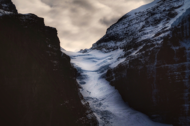
This image is intended as an abstract impression of an evening on the Pacific Northwest coastline.

(2) THE PICTURE

“Coastlines” is a blending in Photoshop of two separate digital images, but three digital files. I used one of the pictures twice.

– The first image was shot June of 2010, Nikon D200, Nikon 18.0-70.0 mm f/3.5-4.5 lens, at f/8 and 1/125 sec, no flash, ISO 100. I was on a ferry, the photo is a typical view of the coastline as the ferry goes by.

– The second image, used twice, a closeup of water in a pan, was made indoors with a Nikon D7000, Sigma 150 f/2.8 macro lens, Metz flash, at f/5.6 and 1/60 sec, ISO 100. The setup for this picture is:
. pan of water on a table
. dark room
. reflective material (wrapping paper in this case) behind the pan
. camera, on tripod, at a bit higher than water level
. flash on remote cable to the left side illuminating the paper behind the water
. carefully focus on a point in the middle of the pan – I use a paperclip to aid in focusing
. move the water around gently – I used a Rocket blower to blow air onto the surface to move it as if it were waves
. shoot

I used two versions of this image, the standard shot, and then the same shot with a “fisheye” distortion applied to it.

(3) PROCESSING

Software used: Adobe Bridge and PhotoShop CS5, Photomatix 2.0.2 plugin, in camera (Nikon D7000) editing

Both images were shot RAW and converted without adjustments from Adobe Bridge to PhotoShop CS5, sRGB 16 bit. Once in PSCS5, I worked on them separately first, and then combined them into the final image.

I worked on the second image (water in a pan) first:
– cloned out sensor dust and dust on the surface of the water
– created a copy layer and ran this layer through the Photomatix Tonemapping plugin. I used a mild tonemapping to bring out colour in the dark shadow areas. The settings for using this plugin are very particular to each image, but the idea, for me, is to bring out colour detail in dark areas and brighten up the image overall, without introducing too much noise or creating an image that looks not believable.
– blended this copy layer in lighten mode with the original
– used curves to adjust colour/contrast
– the Nikon D7000 has an editing feature, “fisheye”. I created a second version of this image using this fisheye distortion, and opened it. In PhotoShop, I had to do the same corrections/adjustments as to the non-fisheyed image, except that before using Photomatix I needed to convert the 8 bit JPG created by the D7000 to a 16 bit image for Photomatix to recognize the file.
– Once I had these two versions of the same image, I stacked them, background layer 100%, fisheye layer in normal mode, opacity 50%. Merged.
– Adjusted curves in the merged version.

Then I worked on the image of the strip of land and ocean/sky:
– Adjusted the horizon line to make it perfectly straight
– Increased contrast (curves) to a much darker strip of land

I then made a copy of this image and pasted on top of the water in the pan image. The water image was larger than the land image, because the D7000 creates larger files than the D200. This was not a problem, since I was using only portions of the strip of land image
– Set opacity on this top layer to 50%, to figure out where I wanted the horizon line to be placed. Moved the picture until satisfied.
– Once satisfied, I created a mask for the portions of the strip of land image that I wanted to keep. I discarded all information below the horizon line (on the strip of land image), but softly blended in the clouds with the water image. The dark land area I kept completely.
– I blended the two images into one (select all, copy merged, paste)
– I then worked on final adjustments to contrast/colours using curves and selective colour adjustment layers in PSCS5.
– Again, select all, copy merged, paste for a final workable copy
– Gently and carefully dodged/burned the horizon line and the land and just above the land portions of the image.
– Saved as a TIFF, and saved another resized/sharpened version for web presentation.

(4) OUTCOME

My hope is that with images such as “coastlines”, images that are impressions of a place or a subject, I can get to the essence of what makes a subject what it is.

Loosely, these photos are “photo-impressionism”. With them, I can abstract subjects and provide much more character than with a representational photo. Photo-impressionism allows me to express feelings, thoughts, dreams, and fleeting moments in time, when a small change in light can make the difference between utterly glorius and plain drab.

But more so than anything else, the concepts of photo-impressionism make me, and the viewer, pay attention to colour. I love colour! I play with colour and use it almost as if it were the subject itself, which, in a way, it is, at least in photography. Light is colour.